in this post i will be talking about how i created the unique pikachu, just above this text is the character pikachu that i will be basing it on. i have chosen to do research on both 2d and 3d characters to get a better understanding on how the character looks, also i wanted to choose the best emotion for pikachu so i picked the top common facial expressions and used them for my project.
to start any project off you need to start with the basics so i had to start with a null object which is a blank basic object which could be a prism, circle or rectangle etc. in this case i am using a sphere, in the bottom right corner it gives you options on how to customise your sphere changing the shape and its attributes. one key technique i use is by changing how many faces you can have on the shape making it easier in some ways to edit for instance if you wanted a shape with only four editable faces on one side of the shape you can change it in attributes therefore making it easier for you to edit. in this case because of pikachu's basic shape all i had to do was use the the default sphere due it granting me all the faces i need.
to access these key features all you have to click on is the object box just like the one you see above, you will see just below everything object properties and this will give you how many segments you wanted which would change the amount of faces i would have on the sphere or you could change the object type by clicking simply the 'type' link which will give you a list of names that will change the object so you don't have to change the segments.
now to start editing any object you have to make sure its 'editable' in this case its located in the top left corner, you have to make sure the object is selected first that will highlight all the tools on the left hand side. the one you want to click will be the image with two circles facing each other. once clicked it will show up grey this means that your object is now editable. making an object editable grants you access to stretching the image, cutting certain layers on the image and pulling the segments individually etc. if you need to curve the image its much easier to use the magnet tool, you can access the magnet tool by clicking the structure tab at the top of the screen this will show you a menu of tools to choose from or you could use the shortcut key 'M-I'
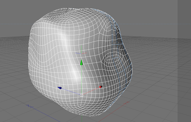
once you've clicked the magnet tool it will come up on your screen looking like this, the centre of the tool will focus on points of your null object. for instance each face or segment has four points surrounding it in each corner so the magnet tool will focus one what corner yo want to drag out. in my case i need to create cheeks for my character, so i need to focus on two places on my sphere.
to make my image smooth i used a hyper nerb to smooth my object out, you can locate the hyper nerbs by clicking the third box straight above my image it also looks like a cube with wire surrounding it. by clicking the box it then sends it to your column on the right, to make your image smooth all i had to do was drag my sphere into the hypernurb which makes my image rounded and smooth.
the next thing i did when i had created my basic shape of the head was create the material that i want on my image, to get this image i collect an image off google of pikachu's face and graphically redesigned his face to match my character. i used photoshop as my software and to do this i cut my background out and filled in his face with the same colour as pikachus face which was a dirty yellow. i had to save it as a jpeg and then all i had to do was drag my material onto my object.
when i first dragged my materials onto my object it came up like this, it tried to over stretch my material by covering my whole object back and front which would have been okay if the image was blank but my image wasn't blank it had decals on it which was pikachus face, i had to decide which was my best option in trying to change the position of my material.
after trying all the different settings out on the list i came across 'flat' which would help me in changing my materials position properly, you have to keep in my mind also that if you don't want the image to be copied and reproduced all over your object then you have to click off the tiling effect located just below the list of projections. if you did apply he tiles to your image it would copy your image over and over again filling your object with pictures of the same object. another technique to bear in mind when clicking the projection 'flat' is that just below the projection there is a tab called 'side' this tool places the image on the side you desire. you can choose from front, back an both. in my case all i wanted was the front of my object to show pikachus face so i chose to front.
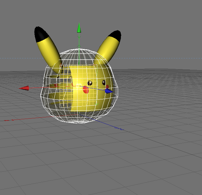
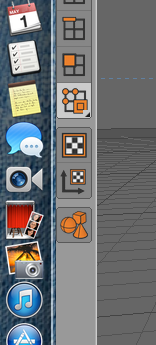
In these images above it shows what my image will look like after choosing all the settings on my attributes, now before i can manually move my material i can only move my object as a whole so i needed to move my material so it will be in position and and match the actual pikachu. to manually move the image you have to click the button on the bottom left corner, it looks like a checkered board with and arrow pointing upwards and right. this will allow you to only move your material instead of the image as a whole. with my material it was trial and error trying to find out how to fit my pikachu face onto my image, for example i first started with pikachus face it was quite large and when i placed to onto my object it didn't quite fit due to the rest of the image having to be coloured in yellow too so i had to make the face smaller and the background lager, this was so the back of the head on pikachu was covered and the face didn't look distorted.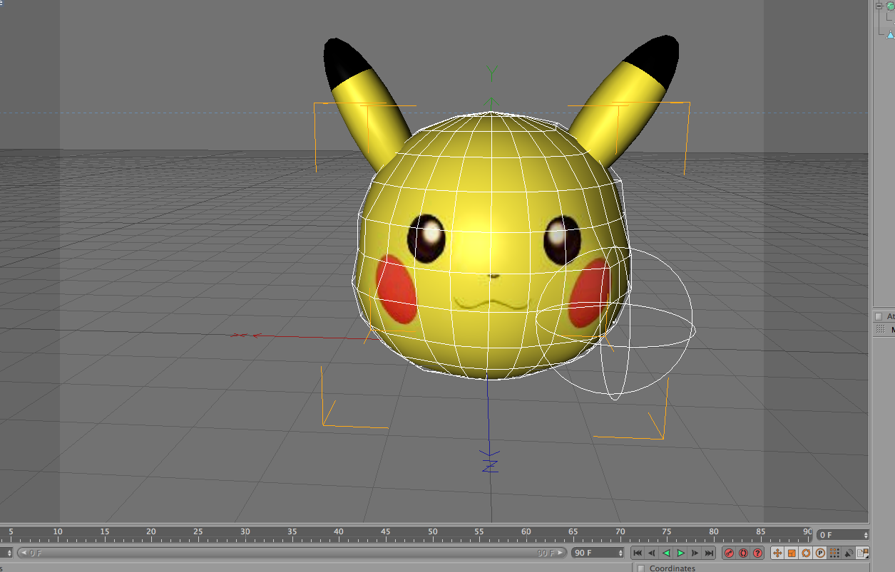

To create my ears i used the same techniques as the ones above, except i used rounded cylinders instead of spheres , and just created a simple material in photoshop and adding it to my cinema 4d. after the material was placed i found it more easy to get a concept of how round his face was so i went back to the magnet tool and rounded off certain edges and brought out parts to emphasise his cheeks.
to create these extras i used the same techniques as i used in creating the head, however in this case i used a different material but the same colour, i used the same program (photoshop) in doing so i already had the colour i needed to create a base for my tail, my ear and my feet. because of pikachu's simplicity when creating these objects it was fairly straight forward. i used one null object to create the tail which was the rectangle object. i flattened the rectangle and pulled the y axis of the rectangle to move it up and then copied and pasted the object so the width of the object would stay the same. when moving the object i always dragged the rectangle by using the arrows and never manually moving it. this way my shape would stay aligned with each other and not look obscure side by side making the objects look connected. after my tail had the basic shape of pikachu's tail i just dragged the material i created onto my tail painting the whole thing yellow. for pikachu's feet i created a sphere object and used the magnet tool to shrink it down to size, one key technique i used was by selecting the centre of the sphere and bringing the y axis towards the top then selecting the only the bottom segments of the sphere then dragging them towards the top. this technique grants you the capability of rounding the bottom half off and creating a circular based foot. for the ear i used the technique called "set selection" this is when you want to create different colours or set different materials onto one object. i fist began with a sphere then stretched it to create the shape that i desire, then i used set selection to create the top half being black then the bottom half being a dirty yellow.
last but not least i had to create a body for my character, this was the most time consuming bit due to trying to match the length of the actual pikachu himself. trying to keep his head in proportion to his body was the hardest bit because i didn't want his head looking too large and overgrown for his body so it took me more time to match his characteristics. when creating this body i used a square then magnetised it down then hyprnerved it keeping the image rounded and circular. after i had created the body i dragged the material over to it and then placed it in with my head.
this was my final piece finally created, i enjoyed this character due to it being him being in my favourite cartoon as a kid. i am pleased mostly with how his face has turned out, because i used the original face from the character i believe it has helped me capture the realism of pikachu.


